Project
Eclipse UI/UX App Study
Overview
Eclipse Theater is a service design project that has been visualized to help users order food and snacks in a dark movie theater setting. This mobile application features a simplistic yet highly effective design, focusing on efficiency and discreetness to achieve the user's end goal.


My process
As the sole UI designer and UX researcher, I was able to familiarize myself with concepts of user research, wireframes, information architecture, and other processes that culminated into a mobile application. This challenge allowed me to become familiar with the most basics of UI/UX design and I am excited to learn and practice these lessons more!
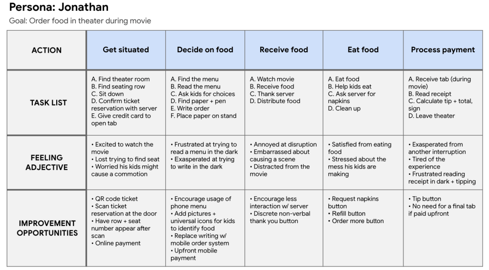
To address the challenge I craeted of integrating mobile applications in a movie theater setting, I recognized the need for more focused research. I initiated the process by developing a user persona, which enabled me to pinpoint the problem statement:
"Current dine-in movie theaters have clunky and inconvenient ordering systems that discourage users from ordering food during a movie."

Following the identification of the problem, I delved further into the 'Johnathan' persona by mapping out his user journey. This exercise helped me uncover potential solutions that could address his specific needs. Ultimately, it became evident that the optimal solution would involve crafting a discreet and user-friendly mobile experience, encouraging users to utilize their phones in the traditionally 'no technology' environment of movie theaters.
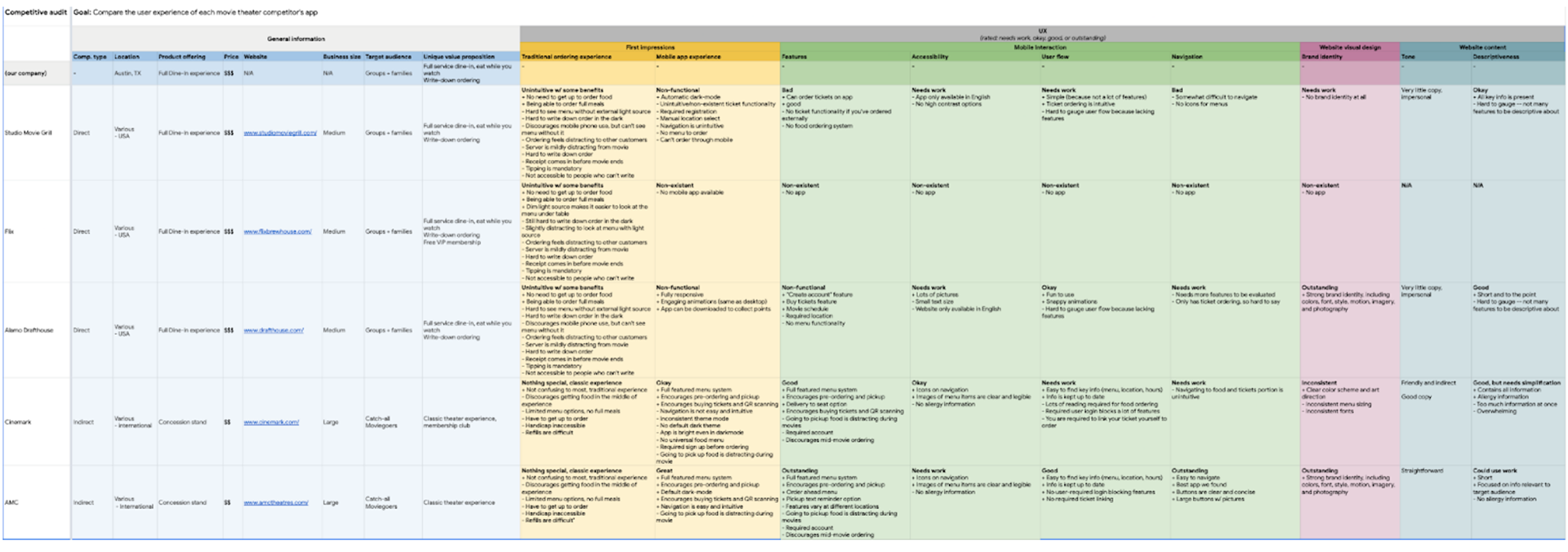
The competitor analysis allowed me to conduct a comprehensive comparison of five different companies. I evaluated factors like initial impressions, layout design, and user interaction to gain valuable insights! Additionally, I expanded my research to include the food ordering processes of indirectly related competitors, such as Sonic, CAVA, and Starbucks.
IPersonally my favorite part, I complied all of my research into creating user flows and sketches of the possible mobile apllication! I focused on streamlining user interaction to achieve the purpose of this app: "As a user, I want to be able to order food at a dine-in movie theater as discretely and quickly as possible."
I was able to achieve this through the Crazy 8 design sprint method, culminating into low-fidelity wireframes as shown below.

I sent out my low-fidelity wireframes for testing and found that users:
• were worried about the brightness of the app
• were confused with the placement of the QR code on the homepage
• liked the simplicity and minimalistic nature of the app
• appreciated the action screen dedicated to the server
I considered all of their input and came up with these solutions:
•I made the app using colors that were visible at the lowest brightness setting while still being non-distracting to others
•I made a tutorial at the beginning of the app to lower the brightness and to turn on Do Not Disturb
•I took out confusing icons and opted for more universally known ones
I then implemented all of the changes into the final design!
This project provided me with numerous valuable insights, particularly emphasizing the significance of collaboration within a team to produce more refined results with how many hats I've had to "put on" for this project. While I take pride in managing this project independently, I recognize that having additional team members would have strengthened the application further by facilitating the exchange of ideas and expertise.
Moreover, I gained a deep appreciation for the importance of user research and testing. While I personally favored the UI design aspect, I realized that without thorough user research, my designs would not align with users' needs, rendering them ineffective. I also discovered the benefits of conducting UX research earlier in the project timeline, allowing me to refine design functions and features at an earlier stage, which I came to value immensely.
I had fun with this design challenge and will be working on more mock case studies to furter refine my skills!